

I worked on the design concept for the Finlab website — a fintech product focused on helping businesses find and apply for bank loans. I joined the project after the previous designer had left and brought it to release within the planned timeframe.
The work was done at Crauch studio under the art direction of Anton Kravchenko. At the start, the project already had an established brand identity. My task was not to reinvent it, but to carefully evolve it and bring the interface to a stable, cohesive system.
Development
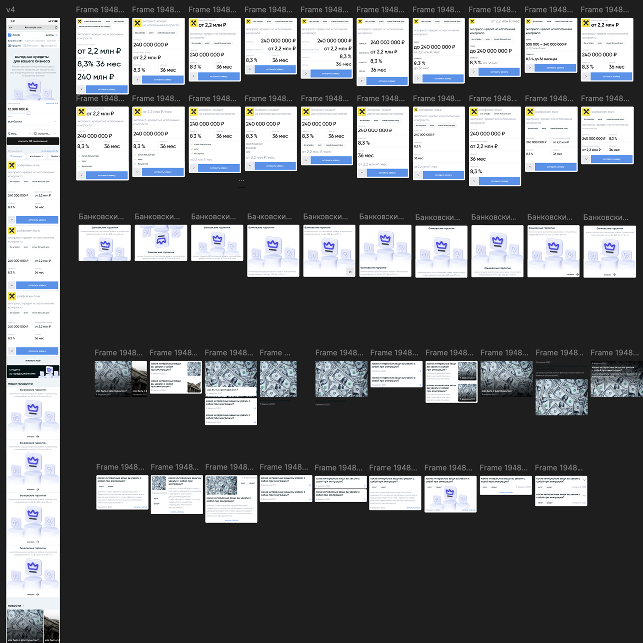
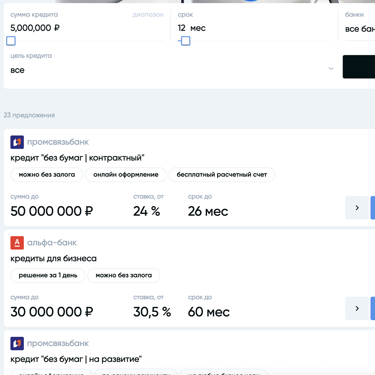
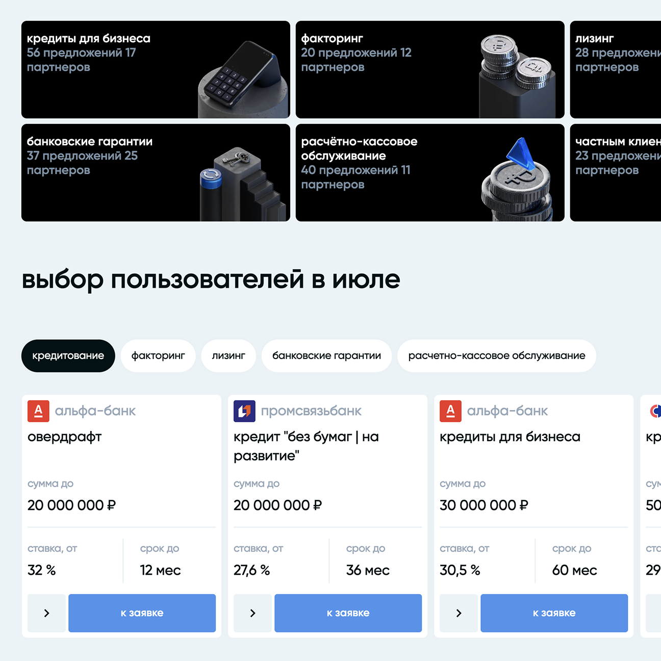
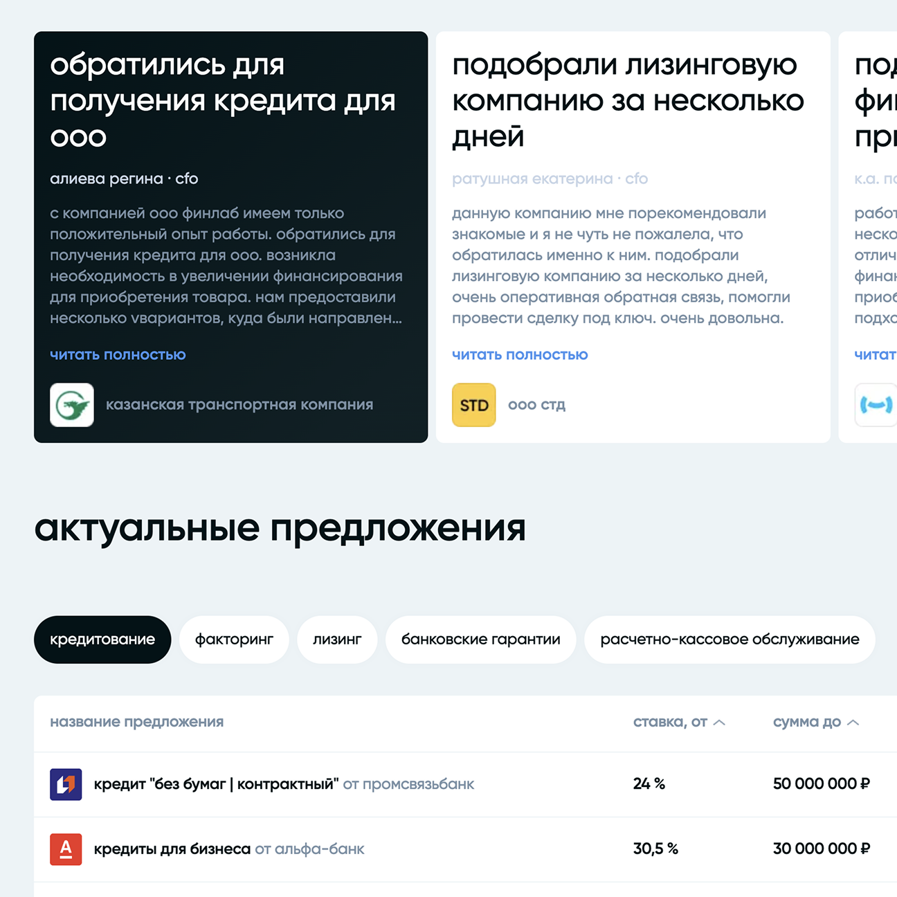
The product operates with a large amount of data: loan amounts, interest rates, terms, filters, and offer cards. The key challenge was to keep the interface visually calm while preserving clarity and control.
The design process followed a mobile-first approach. All core scenarios were designed for mobile screens first, then consistently scaled to tablets and desktop. Responsive behavior received special attention: grids, spacing, typography, and content density were tested across breakpoints to keep the interface predictable on any device.
I was responsible for screen structure, offer selection logic, product cards, and the main user scenarios. All decisions were made within the existing visual language, with a focus on consistency, readability, and long-term stability.
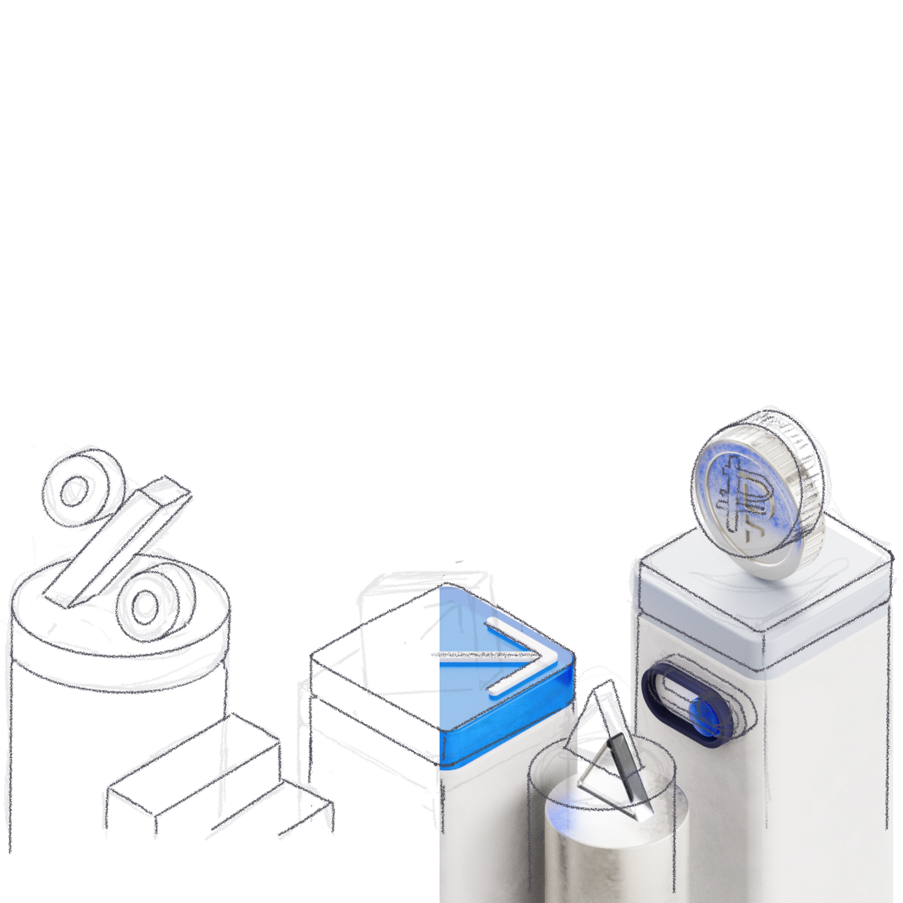
3D graphics
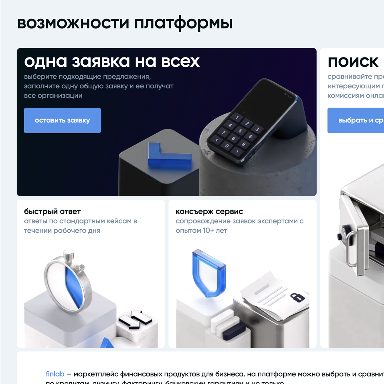
A separate part of the project was work with 3D graphics. Together with a 3D designer, we defined the character, shape, and role of the objects within the interface. The graphics had to reinforce a sense of technology and reliability without distracting from the user’s main task.
The 3D elements were integrated into responsive layouts and worked correctly across all screen sizes, without breaking composition or visual rhythm.
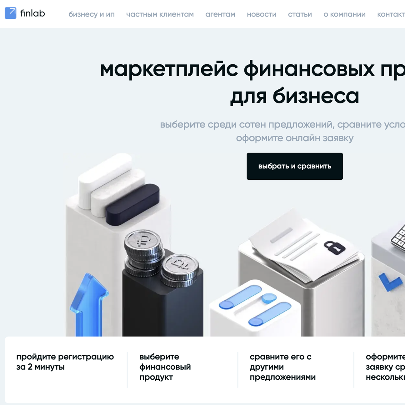
Visual design
The main focus was on loan offer cards and the selection flow. The interface needed to work equally well for quick scanning on mobile and for careful comparison on large screens.
I structured the rhythm of the cards, the hierarchy of numerical values, and the typography so that key parameters are readable at a glance, while secondary details do not overload the screen. The same logic was preserved across all breakpoints, without creating “special” versions of the interface.
Takeaways
The result was a visually balanced and stable interface, designed with mobile scenarios in mind and ready for long-term development. The project was released on time and became a full-fledged part of the Finlab product line, seamlessly fitting into the overall ecosystem.
This project was my first deep dive into working within a strict brand identity and established studio processes. I learned to design mobile-first interfaces not as a collection of images, but as part of an architecture where responsiveness is built into the logic of every component.
The main challenge was evolving the existing visual language: I needed to introduce new features so they felt “native” to the product. As a result, I learned how to carefully scale a system without creating visual noise or breaking its consistency.
